

Easy Positioning with CSS Flexbox..!!!
A Quick Overview of CSS Flexbox to make your life in development easier.

CSS Flexbox, What is it?
Flexbox is a 1-D layout method for arranging items in rows or columns. Items expand to fill additional space or shrink to fit into smaller containers. Here we are going to discuss most of the things flexbox offers.
Flexbox offers the same set of things provided by CSS positioning but in a much more straightforward, flexible way. The main thing we keep in mind when using the flexbox is the container and its children.
Let's dive in
FlexBox Properties
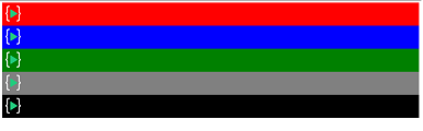
This is without the flex property.
 .container{
    gap: 10px;
    display: flex;
}
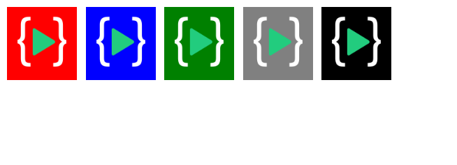
By default, the flex-direction is row so all the elements inside the container are aligned in a row.
We can also add values to the flex-direction property
.container{
    gap: 10px;
    display: flex;
    flex-direction: column-reverse;
}
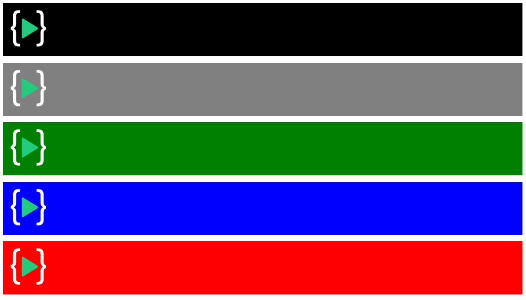
flex-direction has 4 property values we can use. What flex-direction does is, it changes the axis according to the property value we assign.
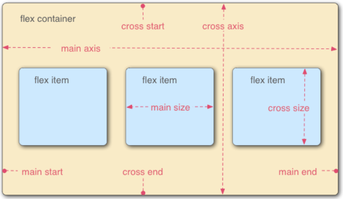
This is an image from MDN docs that gives us a better understanding of the axis. When we used flex-direction: column-reverse the main axis became from bottom-to-top and the direction matters for the upcoming property we will be exploring. The 4 values for flex-direction are given below:
column: This value places the flex items vertically, from top to bottom.column-reverse: This value places the flex items vertically but from bottom to top.row: This value places the flex items horizontally, from left to right.row-reverse: This value places the flex items horizontally but from right to left
Flex-wrap

This happens when we have too many items clumped up together, to solve this issue we have flex-wrap because by default the flex items try to shrink and stay in the row/column so we need to add additional property to remove that skewed look.
.container{
    gap: 10px;
    display: flex;
    flex-wrap: wrap;
    border: 1px solid red;
}
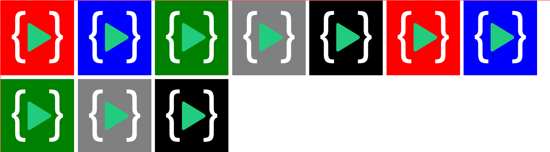
flex-wrap has 3 property value
wrap: This will be wrap flex items in multiple lines from top to bottomno-wrap: This property doe not affect the row in any mannerwrap-reverse: This property is similar torow-reversewhere it wraps the items but in reverse order that is bottom to top
flex-flow
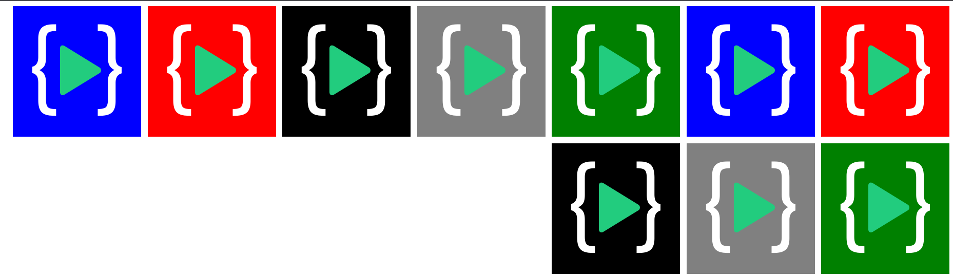
Now that you have learned about the two properties, lets combine them with flex-flow
This property is combination of flex-direction and flex-wrap and the generic syntax would be flex-flow: flex-direction flex-wrap
.container{
  flex-flow: row-reverse wrap
}
justify-content
This is one of the property which is affected by the flex-direction. This property aligns the items along the main axis which is decided by the flex-direction. For simplicity we will be using flex-direction: row.
justify-content: flex-start

justify-content: flex-end

justify-content: space-between

justify-content: space-around

justify-content: space-evenly

align-content
This property displaces the items according to cross-axis. We have taken a flex-direction: row so in the upcoming examples the displacement will occur in y-axis.
align-content: flex-start
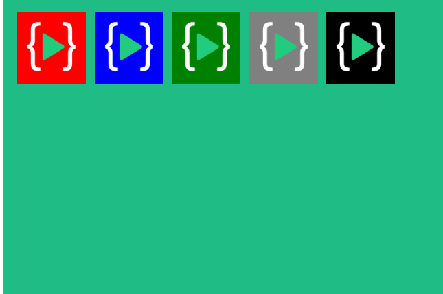
align-content: flex-end
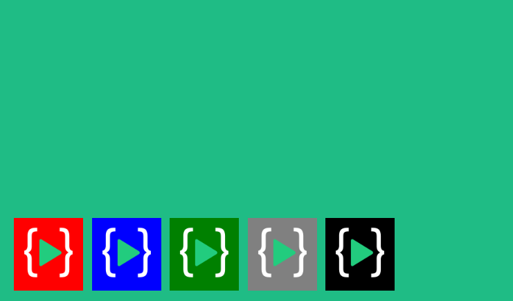
align-content: center
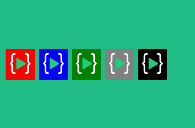
align-content: stretch
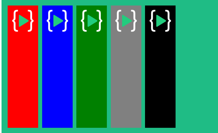
align-items
This property aligns the flex lines. It defines how the flex items should distribute vertically on the current line. It is for items in a single row. Major difference between align-items and align-content is that `align-content doesn't interfere with items in a row but with rows itself.
stretch: Flex items are stretched to take up the leftover space.flex-start/start/self-start: Flex items are placed at the start of the vertical or cross axis.flex-end/end/self-end: Flex items are placed at the end of the vertical or cross axis.center: Flex items are placed in the center along with the cross or vertical axis.baselines: Flex items are aligned such as their baselines align.
Other Propeties
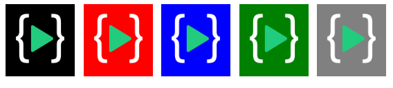
Order: This property decides the order in which elements are positioned. by default the elements have a order of 0. So, if we want to bring something to front we can assign it a lower value like order:-1 or if we want to push something to the end we can assign it a higher value.
.blacklogo{
order:-1
}
.redlogo{
order: 6
}
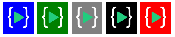 In the above examples we pushed the red logo at the last by give it a higher enough value. And brought the black logo in the front by applying it an lower enough value
align-self: It can be used to override the align-items by applying it to an individual element.


